✝️🚗🚫🛑
RETIRED ROAD SIGN, INK, MIXED MEDIA
RETIRED ROAD SIGN, INK, MIXED MEDIA


Photos by R George
This work immerses a road sign in a hand drawn optical illusion. This sign was picked specifically because I encountered it in life and interpreted it as: cars with crucifixes don’t stop. I then wondered how I would spot crucifixes on vehicles in cross traffic.
The word, cross, can be interpreted as an intersection, a crucifix, an addition symbol, if diagonal multiplication. It can mean to pass, to betray, to extend beyond, and to mark. It is quite miraculous that in seconds, our brain is asked to read a sign, maneuver through possible meanings, and choose the most accurate assumption based on given context.
︎
LETTER FORMS
COLOR PENCIL DRAWINGS ( 20” X 26”)


Photos by R George
The difference between a F and an E is a line. The difference between a P and a B is a curve. The difference between an H and an A is a line. The difference between a N and a M is a line. This work utilizes color and scale to abstract and magnify recurring shapes in the alphabet.
PERSONALIZED COMMISSIONS:
LETTER FORMS
INTERESTED IN HAVING TWO LETTERS JOINED TOGETHER?
CLICK HERE TO INQUIRE
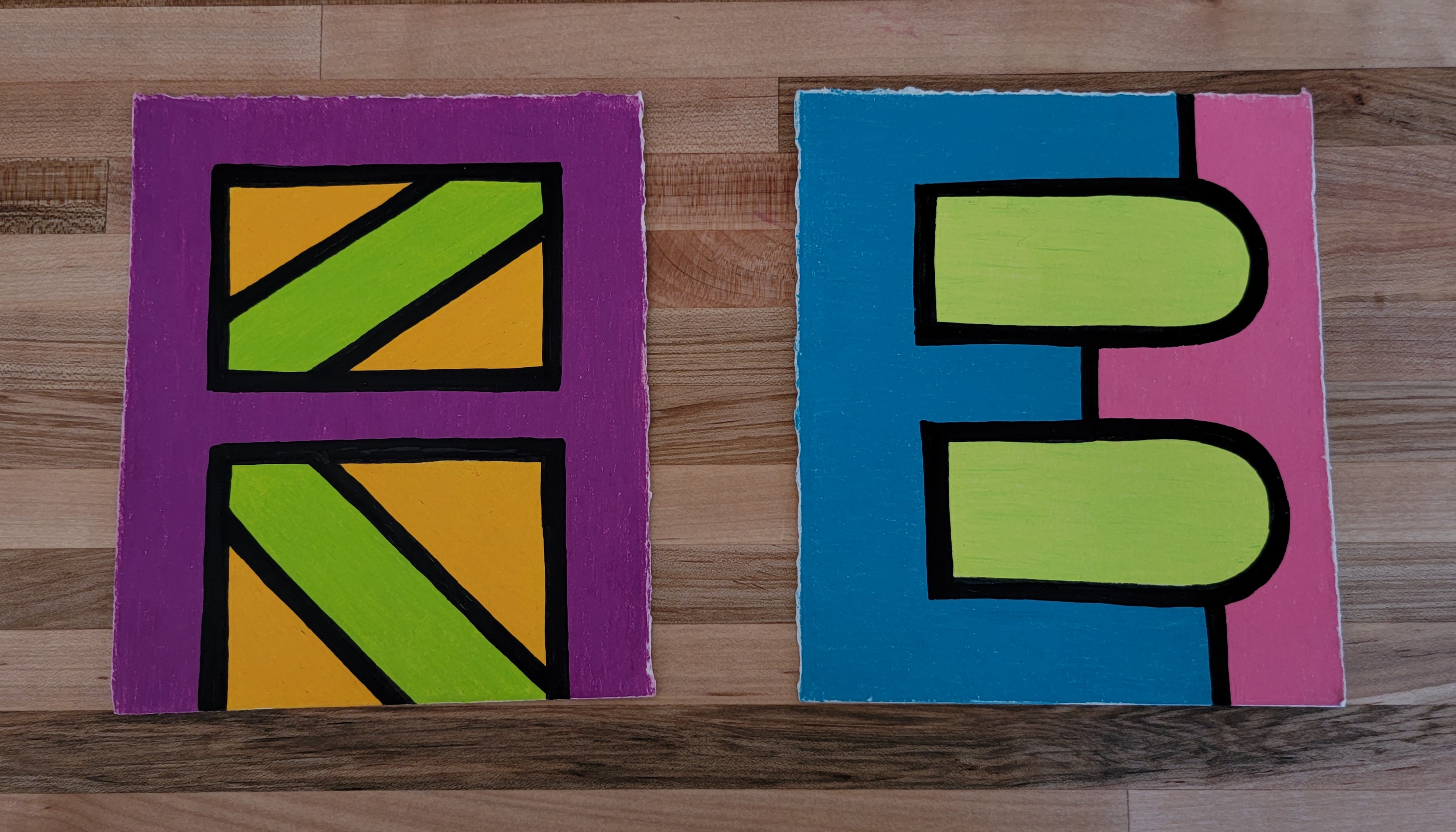
LEFT > RIGHT: K/A & E/B